Case Study · Great Learning
GLDS: one source of truth for a product suite that was drifting apart.
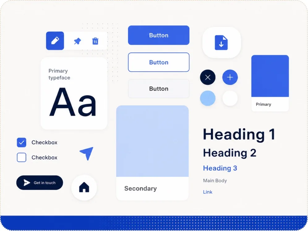
A design system across web and mobile, built on Figma variables and tokens, that cut developer effort 50% on program assets and lifted visitor-to-lead 72% on top pages. One file became the single source of truth a fast-scaling product team didn't have.
- Role
- Lead UX Designer
- Team
- 3 Designers
- My work
- UI audit · Token architecture · Component library
- Timeline
- 6 months
Impact
Developer effort
−50%
On program-asset creation, off a shared definition instead of one-off builds.
Visitor → lead
+72%
On top pages built on the system.
Source of truth
1 file
Tokens and components shared across web and mobile.
The stakes
Great Learning went from 500 people to 5,000. The products multiplied with it — marketing sites, application flows, the learning app — and they stopped looking like the same company. The source of truth lived at the developer end, in MUI. Design had none. Every designer rebuilt the same button their own way, and the gaps between products widened into real usability debt.
In a growth phase that's expensive twice over. Hard-coded, scattered components made production bugs hard to trace and fix. And the same problem kept getting solved five different ways, because there was nowhere to solve it once.
So I took the initiative to build a design system from scratch in Figma — so that, at least on the design side, everything came from one place.
The brief, and the reframe
The easy version was "make a UI kit." That gets you a folder of components and the same drift a year later.
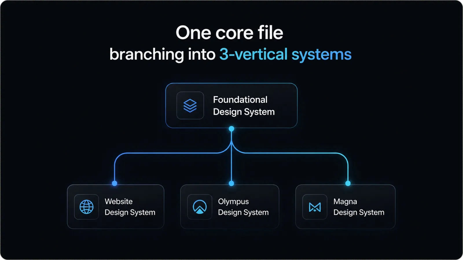
"Build one source of truth that branches per vertical — so colour, type, spacing, grid, elevation, and motion all originate in a single file, and each product inherits them instead of reinventing them."
A design system is a living thing, not a deliverable. So the goal was to get the foundations right first — the layer everything else compounds on — and let the components follow.
The audit: where the drift actually was
Before defining anything, we audited every product for the variations that had crept in. Three areas told the story.
Typography
The product splits along the user's journey: the website and application flow a prospect sees before enrolling, and the web and mobile app they live in after. Two journeys, two type needs — accessibility-tuned for the web, device-flexible for the apps. We kept the split deliberate: Poppins for the website, Inter for the products.
Colour
The messiest part. The same colour existed in a dozen near-identical tones across products. We catalogued every one and mapped it to a single definition, then checked it against the brand guideline. The brand primary failed contrast on the web, so each failing colour was swapped for the nearest accessible match — with dark-theme mapping planned in from the start.
Grid & spacing
No shared definitions at all. You could see it in layouts and breakpoints behaving differently across products for no reason.
The architecture: tokens that branch and adapt
This is where the system earns its keep. Instead of a flat library, I built it as layers — each referencing the one beneath — so a single change ripples everywhere it should and nowhere it shouldn't.
Type scale. Base 16px, stepped on a major-third ratio (1.25) via Typescale, so each size derives from the last rather than getting picked by hand. Predictable, and wired into the responsive layer below.
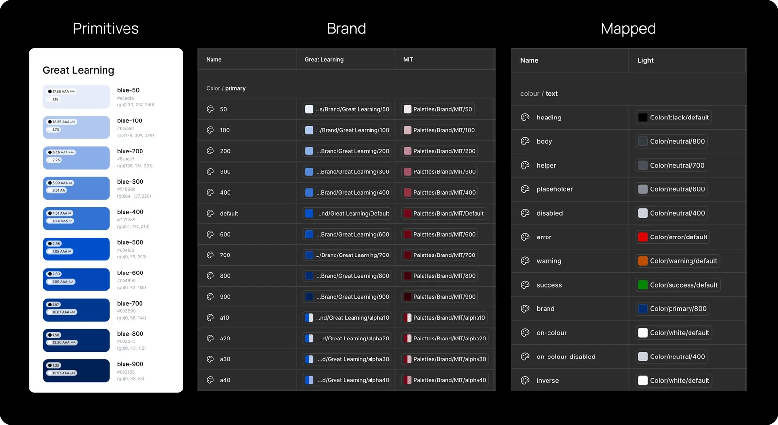
Colour, in three layers:
- 1.
Primitives. Raw colour values, never seen by the end user. The vocabulary.
- 2.
Brand. References the primitives, one mode per brand. Switch the brand, and the whole palette changes in a click.
- 3.
Mapped. Semantic roles: text, surfaces, layers, borders, items. References the brand and carries light and dark modes. One definition, many outcomes.
Responsiveness, built into the tokens. A Responsive collection with two modes, mobile and desktop, grouping font, spacing, icon, and button sizes. Select a mode and every mapped size shifts to fit the screen. The responsiveness lives in the variables, not in a hundred manual overrides.
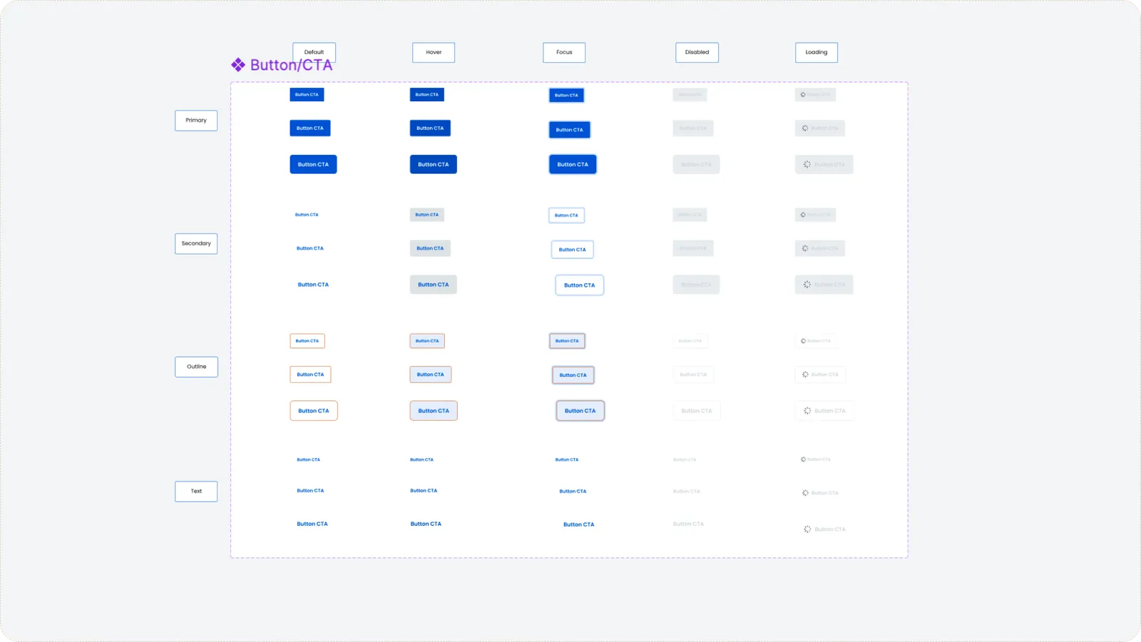
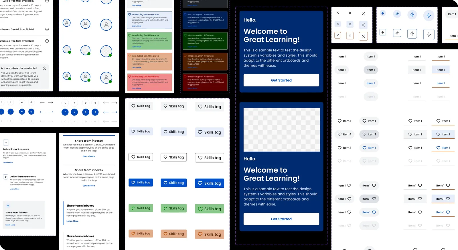
Components. With the foundations set, components came together fast — each built with properties to stay modular and cover the cases the audit surfaced. Over six months every component was stress-tested to be brand-specific and breakpoint-aware. A single button carries more states than it looks.
Impact
- −50% — Developer effort on program-asset creation — designs shipped faster off a shared definition.
- +72% — Visitor-to-lead on top pages built on the system, off a common thread with other factors in play.
- 1 source of truth — Products started to look like they belonged to the same brand, and changes became predictable instead of archaeological.
What I'd keep
The system became the foundation other sub-systems later branched from — which was the whole bet. Get the foundations right, make them a living, branching thing, and cohesion and predictability come almost for free. The hard part was never the components. It was building the layer underneath them, so the right change only ever had to be made once.
More where this came from.